Wednesday, November 24, 2010

Week 14: Magic with Brushes


Craft: This image was created with using only photoshop brushes. I created layers for each different part of the image. The first layer was the black background with the textured brush colored green. I used the some textured brush for the cover of the book, but changed its hue from green  to light brown.  The swirl that come up over the book was created in another photoshop document to be turned into a brush. I did this by opening a new document in photoshop that was 2500 x 2500 pixels with a resolution of 300, and making sure it was set to gray scale.  I import my image and use the eraser tool to trim up the sides, and once complete I turn it into a brush.  To do this I go to Edit and define brushes, then I titled my brush Magic_1 and saved it to my photoshop brushed. Once the brush was saved, I returned to the document above and used the brush I created to make the book look surrounded.

Concept: The concept of this image it to show the dark magic that is incorporated with this book.  The book is as sketch of the "Book of Spells" that is shown in the Hocus Pocus movie.  I wanted to use a green swirl because when the book was opened in the movie a blast of green light the emanates from the inside of the book that can only be seen by the witches, so I wanted to show that same light that is in a smokey form lifting the book into the air.

Composition: This image is composed of many different layers have different kinds of brushes used to create the sense of the magic book from Hocus Pocus.  There are regular brushed that are used to compose the snakes on the corners, the eyeball and its latch, and the snake on the spine of the book.  It is also composed of some vector brushes that give a textured look to the cover of the spell book.

Sunday, November 14, 2010

Week 13: Texture Collage


Craft: What I used to create this image was Adobe Photoshop.  I imported the images that I scanned onto the computer. The textured images are of a hand towel, football jersey, a dress shirt, and a leaf.  After placing these images in photoshop I used the magnetic lasso tool to cut out the image from its white background.  I also used the regular lasso tool to create the abstract shape of the tree. For the change in the grass color I clicked on Images then Adjustments, and went to brightness and constant to change the towel from blue to green. Once this was complete I created the fence, I changed the color using the hue and saturation under the Adjustments menu as well.  I used the rectangle marquee tool to crop out the shapes of the fence. I cut out one fence post, and one long piece for the horizontal part of the fence then just duplicated those pieces and put them together to form a fence.  The background is the image of a leaf that I rotated to look like sun rays.

Concept: The concept of this image was to use textured fabrics and things found in nature to scan into the computer to create a collage.  My collage is of a individual apple tree. I wanted the pick shirt to be used for the apples since it was already the right  color.  The reason the tree is blue is because I wanted to use the original color of the towel before I used that texture again.  I incorporated my football jersey into the trunk because the holes in the jersey are similar the the bums and texture that would be found on tree bark.  I also wanted to use the zoomed in view of a leaf because if look just like sun rays and it went well with the idea of a apple tree.  It gives that final touch that makes the image look as if it is in the middle of a prairie or an orchard and the sun is shining over head.

Composition: This image is composed of three textured items and two leaves.  The textured items are set up in such a way to represent grass, a fence, and a tree.  The leaves were set up to represent two different things.  One leaf is used as the actual plant. It is positioned at the bottom of the tree and the fence posts to resemble weeds.  The other leaf is positioned in the background as the light from the sun. 

Wednesday, November 10, 2010

Week 12: Re-Color


Craft: The tools used to create these three images can be found in Adobe Photoshop. I opened my photo in photoshop and double clicked on the layer called "Background" to turn it into layer 0.  After this was done I went to Image and Adjustments, then changed my original photo to black and white. When the image changes I added a new layer from the layer button located next to the trash can in the layer window.  I chose a color to use for the background layer (Layer 1) and moved the it underneath the existing "Layer 0."  When the color was set I clicked on layer 0, and changed its blending mode from normal to multiplicity. This allows the black and white image to show through the existing color.  Then I created another layer (Layer 2) and placed it between layer 0 and layer 1. I chose a brighter hue of the background color, and used the paint brush to color over the bunny. Once this process was complete I used the eraser tool to clean up some of the edges of the bunny.  I created the final player and placed it between layer 0 and layer 2.  For this last layer I chose an even brighter hue and colored in the flower on the bunny's head and went in with the eraser tool again and cleaned up the edges. I used this process for all three bunnies.

Concept: The concept of this assignment was too use three different hues to lead the viewers focal point to two different sections of the painting.  They are created to have one notice one thing to the next. That is why the bunny is lighter then the basket, but the flowers are almost white.  This is because I wanted the flower to be the focal point of the image.  It was the one thing that I wanted to pop the most.

Composition: These three images are composed of my bunny Pfeffernuse (Phefer-noose) who we placed inside a milk crate, and places a flower on his head.  I am amazed that he sat there for the photo. Each images is composed of four individual layers; one being the original photo in black and white, and the other three are the changes in hue to bring out the focal point of the images (flowers).

Monday, November 1, 2010

Week 11 - Funeral Barbie Final


Craft: The tools used to create this final image were the rectangle marquee tool which I used to create the box. I made the size of the box with the marquee tool and used the paint bucket tool to fill in the color I needed for each shape.  I also used the rectangle marquee tool to create the holes that are shown in the box by placing another lighter purple layer on top of the original and then mapping out the size that I needed and pressing the delete button to cut out the holes where you see the toys.  The toys I played in between the two colored layers and then positioned them in the right areas in the box by using the move tool, and making sure the right layer for the toy was highlighted before I moved the toy.  I created a new layer with the layer button and then used the gradient tool to create the light purple and white background shown behind the boxes, then I used a rose stamp tool to add the roses in the background as well. Once the gradient and  roses were complete I changed the opacity to lighten them to give a more subtle touch to the advertisement. Again in this final project I used the "fx" tool to add the drop shadows to the box and the toys. The last tool I used was the type tool.  I used this tool to create the words used on the box and in the advertisement.

Concept: The concept of this ad was to create and display a toy that looks as if it could be placed in store and in magazines, but the actual toy itself was against many moral values.  I wanted to use a two page spread because I wanted this toy to be the only focus, and not have another add on the next page. The reason I put the roses in the background is because it goes along with the funeral concept, because there are floral arrangements placed through out the funeral home, also the roses play into the barbie style as well.  For the add I also wanted to use a more elegant type because it relates to the girly feels of barbie toys.

Composition: This image is composed of the Funeral Barbie in her individual box, and is positioned next to the Barbie Funeral Kit.  In the kit you can see the doll sized casket, tombstone, and floral stand.  The advertisement is composed of the doll box and the funeral kit placed upon a gradient and floral background whose opacity has been changed to about 65%. It also has a "limited time only" notification on the top left of the two page ad.

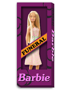
Week 10 - Funeral Barbie Package


Craft: The tools used to create this box were the rectangle marquee tool to create to size of the box that my barbie was to be placed in, then I chose a dark purple to fill the rectangle using the paint bucket tool. After creating the background layer I added another layer of the image of the barbie that I used in the original image of the casket.  Once the barbie was placed on the dark purple background, I duplicated the background layer and placed it on top of the barbie.  I grabbed the paint bucket and chose a lighter purple to fill this rectangle.  The I went into my tool bar and grabbed the polygon lasso tool to cut out the open areas shown on the box.  To create the side and bottom I used the rectangle marquee tool once again to line up the edges and create a thinner rectangle to filled and slanted.  I slanted the sides by going into the top tool bar and clicking on edit, then transform, and then over to screw.  Once this was done I put my mouse next to the rectangle and dragged down to give it the 3D effect. Then I used the brush tool, and changed my brush type to vector and chose a style, and placed it randomly across the box.  For the words I used the "fx" tool found towards the bottom of the layers and added a drop shadow and inner glow.  I did the same thing with the drop shadow for the box and the barbie.

Concept: The concept of this image was to create a box that explains the toy in the least amount of words, and gets the creepy message across from the design on the box. I wanted to used the orange behind the word funeral because it was my idea of incorporating the funeral sticker you receive for you car window into the box.  The reason I chose the colors that I did is because black was too common to use in this sort of concept.  I also chose it because in my town, when someone that works for the village (Police Officer, Fire Fighter, Mayor, Public Works, VFW, etc.) passes away, we hang a black and purple banner from our village hall.

Composition: This image is composed of layers of color and drop shadows to create the Barbie's box and the 3D effect.  It also consists of the barbie that I have used in the previous images of my misfit toy.  She is placed between two layers of color to create the illusion that she is inside the box.  This image is also composed of two different kinds of fonts. The first is used in the word funeral. Its a pretty plain style to just give the basic representation of the actual sticker, and the second is more of a elegant more common type that is shown on barbie boxes found in the typical toy store.