Wednesday, November 10, 2010

Week 12: Re-Color


Craft: The tools used to create these three images can be found in Adobe Photoshop. I opened my photo in photoshop and double clicked on the layer called "Background" to turn it into layer 0.  After this was done I went to Image and Adjustments, then changed my original photo to black and white. When the image changes I added a new layer from the layer button located next to the trash can in the layer window.  I chose a color to use for the background layer (Layer 1) and moved the it underneath the existing "Layer 0."  When the color was set I clicked on layer 0, and changed its blending mode from normal to multiplicity. This allows the black and white image to show through the existing color.  Then I created another layer (Layer 2) and placed it between layer 0 and layer 1. I chose a brighter hue of the background color, and used the paint brush to color over the bunny. Once this process was complete I used the eraser tool to clean up some of the edges of the bunny.  I created the final player and placed it between layer 0 and layer 2.  For this last layer I chose an even brighter hue and colored in the flower on the bunny's head and went in with the eraser tool again and cleaned up the edges. I used this process for all three bunnies.

Concept: The concept of this assignment was too use three different hues to lead the viewers focal point to two different sections of the painting.  They are created to have one notice one thing to the next. That is why the bunny is lighter then the basket, but the flowers are almost white.  This is because I wanted the flower to be the focal point of the image.  It was the one thing that I wanted to pop the most.

Composition: These three images are composed of my bunny Pfeffernuse (Phefer-noose) who we placed inside a milk crate, and places a flower on his head.  I am amazed that he sat there for the photo. Each images is composed of four individual layers; one being the original photo in black and white, and the other three are the changes in hue to bring out the focal point of the images (flowers).

Monday, November 1, 2010

Week 11 - Funeral Barbie Final


Craft: The tools used to create this final image were the rectangle marquee tool which I used to create the box. I made the size of the box with the marquee tool and used the paint bucket tool to fill in the color I needed for each shape.  I also used the rectangle marquee tool to create the holes that are shown in the box by placing another lighter purple layer on top of the original and then mapping out the size that I needed and pressing the delete button to cut out the holes where you see the toys.  The toys I played in between the two colored layers and then positioned them in the right areas in the box by using the move tool, and making sure the right layer for the toy was highlighted before I moved the toy.  I created a new layer with the layer button and then used the gradient tool to create the light purple and white background shown behind the boxes, then I used a rose stamp tool to add the roses in the background as well. Once the gradient and  roses were complete I changed the opacity to lighten them to give a more subtle touch to the advertisement. Again in this final project I used the "fx" tool to add the drop shadows to the box and the toys. The last tool I used was the type tool.  I used this tool to create the words used on the box and in the advertisement.

Concept: The concept of this ad was to create and display a toy that looks as if it could be placed in store and in magazines, but the actual toy itself was against many moral values.  I wanted to use a two page spread because I wanted this toy to be the only focus, and not have another add on the next page. The reason I put the roses in the background is because it goes along with the funeral concept, because there are floral arrangements placed through out the funeral home, also the roses play into the barbie style as well.  For the add I also wanted to use a more elegant type because it relates to the girly feels of barbie toys.

Composition: This image is composed of the Funeral Barbie in her individual box, and is positioned next to the Barbie Funeral Kit.  In the kit you can see the doll sized casket, tombstone, and floral stand.  The advertisement is composed of the doll box and the funeral kit placed upon a gradient and floral background whose opacity has been changed to about 65%. It also has a "limited time only" notification on the top left of the two page ad.

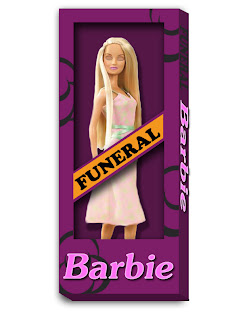
Week 10 - Funeral Barbie Package


Craft: The tools used to create this box were the rectangle marquee tool to create to size of the box that my barbie was to be placed in, then I chose a dark purple to fill the rectangle using the paint bucket tool. After creating the background layer I added another layer of the image of the barbie that I used in the original image of the casket.  Once the barbie was placed on the dark purple background, I duplicated the background layer and placed it on top of the barbie.  I grabbed the paint bucket and chose a lighter purple to fill this rectangle.  The I went into my tool bar and grabbed the polygon lasso tool to cut out the open areas shown on the box.  To create the side and bottom I used the rectangle marquee tool once again to line up the edges and create a thinner rectangle to filled and slanted.  I slanted the sides by going into the top tool bar and clicking on edit, then transform, and then over to screw.  Once this was done I put my mouse next to the rectangle and dragged down to give it the 3D effect. Then I used the brush tool, and changed my brush type to vector and chose a style, and placed it randomly across the box.  For the words I used the "fx" tool found towards the bottom of the layers and added a drop shadow and inner glow.  I did the same thing with the drop shadow for the box and the barbie.

Concept: The concept of this image was to create a box that explains the toy in the least amount of words, and gets the creepy message across from the design on the box. I wanted to used the orange behind the word funeral because it was my idea of incorporating the funeral sticker you receive for you car window into the box.  The reason I chose the colors that I did is because black was too common to use in this sort of concept.  I also chose it because in my town, when someone that works for the village (Police Officer, Fire Fighter, Mayor, Public Works, VFW, etc.) passes away, we hang a black and purple banner from our village hall.

Composition: This image is composed of layers of color and drop shadows to create the Barbie's box and the 3D effect.  It also consists of the barbie that I have used in the previous images of my misfit toy.  She is placed between two layers of color to create the illusion that she is inside the box.  This image is also composed of two different kinds of fonts. The first is used in the word funeral. Its a pretty plain style to just give the basic representation of the actual sticker, and the second is more of a elegant more common type that is shown on barbie boxes found in the typical toy store.

Friday, October 29, 2010

Special Edition Blog

Inspiring Work


Craft: The tools used to make these images range in different varieties.  The first image was created through oil on a canvas and is more of a traditional feel to the art realm, while the second two come from the modern wing of the Art Institute of Chicago.  The second photo I took was of a neon like that is composed of several different works that coordinate in a flashing rhythm to illuminate the shape of the familiar peace sign, and the last image is a collage that is in a remembrance to those who serve, and have served our country.

Concept: I chose these three images as the ones that inspire me most, because they all show a relation to peace and love in their own ways.  The first image shows the scene of a sunset, but instead of the sun shining through the three it is placed right on top of them.  When looking at this paining I feel relaxed and calm, its more of a peaceful feeling to me, its as if I was sitting on my front porch relaxing and just watching the sun set.  I chose the second piece of art work because I love the peace sign in general.  It just has so much power behind its meaning in this world.  What made me love it more was that is was created through neon light that were words such as "love, human, death, animal, nature, etc."  It pretty much just makes the statement that there is peace in all these things.  The final work of art I chose was the military collage.  This picture really struck home for me and I just wanted to take it off the wall and bring it with me.  Growing up in a military family, and working on my enlistment really makes you realize certain things about how we live our lives from day to day, and the outcome of our actions, and sometimes you just grown up faster than those around you.  When I saw this picture is made me feel so overwhelmed with emotion. I was pissed, I wanted to cry, and at the same time I loved it.  It was my favorite.  Definitely a good motivating collage.  This image demonstrates peace through the fact that we are protected by those willing to fight for our freedom and rights, but along with the neon sign; it confronts death and human nature as well...

Composition:  The first image was composed of oil on canvas and create to look as if it were towards the end of the day as the sun was just going down, but instead of seeing it glisten through the trees, we see this orange/red dot that registers in our minds as the sun.  The second image I took is of a neon peace sign that is composed of rods that are bent and put together to form the circle of the peace sign, whose purpose is to hold the words of the sign in place to form the peace symbol.  Some of the words that are on the sign are listed above, but I will list them again (love, human, death, animal, nature).  The last image I took is of a collage that is composed of two different photos, one being of soldiers carrying the flag covered caskets of fallen comrades and lining them up across the pavement, and the other shows a cemetery which appears to be Arlington. Both images were sliced into strips and placed one next to the other to create the dramatic effect shown above.


Monday, October 18, 2010

Week 9: Barbie Funeral Kit


Craft: In this image I used the magnetic lasso tool to cut out each of the shapes from they origianl background to rearange them in photoshop.  I took the Barbie out of a picture of three and used the edit menue to go to transformations and flip her horizontally.  Then I held down control and pressed the 't' bottom to scale her down to size and rotate her to look as if she was laying on her back.  I aslo used the eraser tool to cut out her eyes to fill them in with the paint brush to make them look as if they are closed.  To touch up the edges of her eyes I used the smudge tool to blend all the colors together.  I also used the smudge tool to turn barbie's smile into more of an emotionless smile.  The second thing I did was duplicate the casket by right clocking on the layer and using the "duplicate layer" option. I did this so that I could use the magnetic lasso to cut out the pillow, inside, and wing of the casket.  After I did this I placed it above the duplicate layer so that it looked like one whole casket.  The purpose of this was so that I could use the move tool to place Barbie in between the images to give the illusion that she was inside the casket.  After this I moved on to the flower display.  All I did here was use the move tool to place it in the top right corner.  The final thing I did was create the text on the tombstone by using the horisontal type tool and choosing the color, size, and style for the fornt on the tombstone. I want to use the barbie packaging to place the doll into because she does not come with the set. I might also try to place the set inside its own kind of packagin, but since I cant really find what I'm looking for, I might just use the adversiting look instead of the off the shelf stock look. Possibley combine them both.

Concept: The concept of the Barbie Funeral Kit is that children at a young age are experiencing a sense of death.  Its all about the emotional effect that is to be placed on the child. I was thinking about a slogan or some sort of caption that goes along the lines of "Barbie Funeral Kit: Captures the sadness, without real death".  Its not much at the moment, but I know it should be something along these lines.  The children could possibley burry the toy in their own backyard just for fun so I might try to play into that as well. I want this project to look as if it was an actual rejected toy that was recall from store shelves, or not even made into production.... but, the product idea and advertisement was made as a way to introduce the new toy. So this is why I want to show the advertising and packaging aspects of the toy.  I really like the way the child is shown playing with the Barbie set so this is one of the reasons that I want to try and incorporate both views into my project.

Composition: These images are composed of a Barbie Doll that's face was altered in photoshop to make her look as if she is dead.  Its also shows two caskets that when placed together fit around the Barbie Doll to look as if she is actually placed inside them, and a floral arrangement and tombstone as accessories to go along with the kit.  Each of these imahes were found online and changes to create the product shown on the top.  The websites which I borrowed these images from are listed bellow, as well as in the previous blog post.


Dream Store:

Doll Package:
http://minor-project-heather-young.blogspot.com/2009/10/further-research-and-development-toys-r.html

Barbie Doll:

Casket:
Flowers:
Tombstone:

Wednesday, October 13, 2010

Week 8: Misfit Images


Craft: I am planning on using the magnetic lasso tool to cut out the shapes in the images shown above to arrange them in a fashion to suit the funeral theme that I am going for.  I am going to start off by creating a first layer that has the barbie on the right shown only.  To so this I will use the rectangle marquee tool to cut off the remaining two barbies.  I will also use the pink casket and duplicate it so that I can use the magnetic lasso to cut away the inside of one of the caskets to give the effect that the barbie is actually inside it.  The tombstone will have "Barbie Doll" placed on it using the text tool in photoshop, and the flowers will be left as is.
Concept: The concept of this toy is to create a Barbie Doll accessories/play set that has not been yet created.  It is to play into the idea that children shouldn't be confronting death at such a young age.  So this toy allows kids to set up a funeral scene in their room or what have you and play with each other in what should be a "sad" moment.  So when playing with toys usually beings joy, this toy brings sorrow and grief.
Composition:  This photo when completed will be composed of one barbie doll who is positioned inside a casket.  There will actually be two caskets to feed into the illusion or Barbie being inside the actual casket, and it will also consist of a floral arrangement and a tombstone that reads "Barbie Doll" as accessories to add to the funeral experience for the Barbi goers.

Wednesday, October 6, 2010

Week 7: Final


Craft:   The couple that was located in the front of the mouth has been reduced to one figure that is lurking in the front teeth. He represents the sugars and things that come from eating a cup cake(hence the frosting in his head). The cupcake man has also been moves more towards the right of the image to give it a little more balance.  The next change I made was that of the two men that were standing at the light bulb. I got rid of one of them so that it would look more original, and more believable that the defender has captured one of the cavity people. In place of the figure I removed, I added another cavity creator riding in on a candy bar, he is holding a pick axe to show that he is a danger to the mouth and the teeth.  There is also a child that is running off in the distance that is leaving chocolate foot prints all over the mouth and teeth.  He is just being a nuisance to the defender who is trying to fight everyone off.

Concept: In this finished image of the collage a few changed have clearly been made. From the original first collage the figure were just placed in random positions and were not really telling the story I wanted them to tell, so decided to find more photos to add to the mix that will help get my message across and will also be more entertaining. 

Composition:  The changes that have been made to the defender is that she is now shown as a bigger figure than most of the cavity people. She is also armed with a toothbrush in her hands, and with a roll of dental floss around her shoulder.  This is to show that the defender is ready for battle against what ever the cavity creators try to thrown at her.  She has also captured one of them and this is why there is a ball and chain shown around the figures ankle that is kissing the light bulb.